Rebates : My Account
Product Designer (UI/UX)
Overview
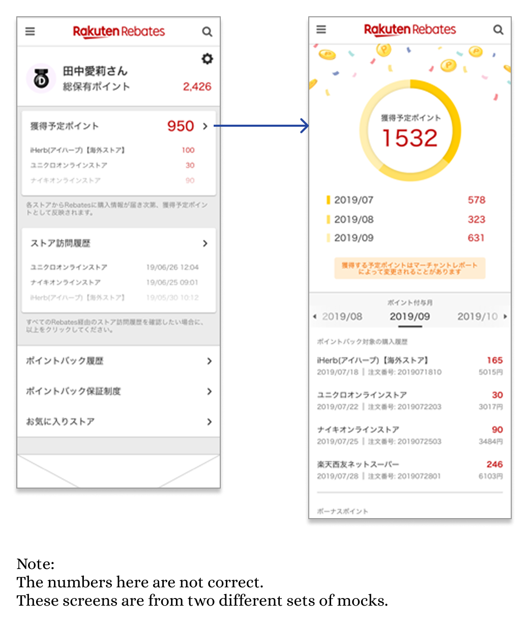
Rakuten Rebates is a Point Back platform in Japan that rewards users with Rakuten Points for shopping through affiliated online stores. When I joined in 2018, I conducted a full service audit and uncovered several usability issues. One key area being the "My Account" page.
This project aimed to improve that page on web, helping users confirm their shopping activity was tracked and better understand their point history.
Problem
User testing revealed that people expected confirmation after making a purchase, but the existing experience fell short. New users often landed on an empty "My Account" page, missing a crucial opportunity to build trust and explain how the service works.
Business Goals
Provide more space to feature live campaigns, supporting Sales and Marketing goals
Serve as the first transition to a responsive layout, reducing maintenance for the Engineering team
Align user education with business retention goals by clarifying how point tracking works
Layers of Complexity
Core Feature Improvements
What is the core use of the My account feature?
How do we define a user’s status through the customer journey?
Responsive Design
How do we stay consistent with current PC and SP design patterns as we convert to responsive design?
Is it okay to introduce completely new UI to this page?
Accessibility & Navigation
Where does My Account live in the navigation?
What events should prompt users to navigate to the My Account page?
Additional Content
How do we educate users about new (hidden) content in My Account?
Can the new content live anywhere other than in My Account?
Measuring Success
With all the layers in mind, how do we measure success?
Core Feature Improvements
Added Complexity
For this project, I was limited by the backend code that governed how points are rewarded.
This process could take up to two months to award points to a user’s account. So I had to devise a way to make this clear to the user as well as make it feel important and worthwhile.
Defining User Status
Working with our BI team, I grouped the users into 3 main categories. As our My Account experience was restricted to logged in members, we did not have to worry about users who are logged-out*.
Member, Non-Shopper: a logged in member who has never clicked on a Rebates shopping link.
This member is considered unexperienced. Educational content is expanded by default.
Non-FTB Shopper or Single Purchase Buyer: a logged in member who has clicked a Rebates shopping link and has made a maximum of one purchase.
For this member, confirmation of “did it work” is more important, so while the tutorial content is still visible, it is collapsed to allow the shopping history to be visible in first view.
Repeat Buyer: a logged in member who has made 2 or more successful purchases.
This member is considered experienced, and so the tutorial content is removed to elevate the point related information.
*In a later phase of this project, I added designs for a logged-out state of this page, but we will not cover that experience here.
Responsive Design
Accessibility & Navigation
When in comes to the smaller phone screen, navigation became a bit more challenging.
I tested a few different layouts with having a dashboard on PC, but it made the page look busy. Through some user testing I also found that the hierarchy of important information was lost due to having many similar components side by side in the first view.
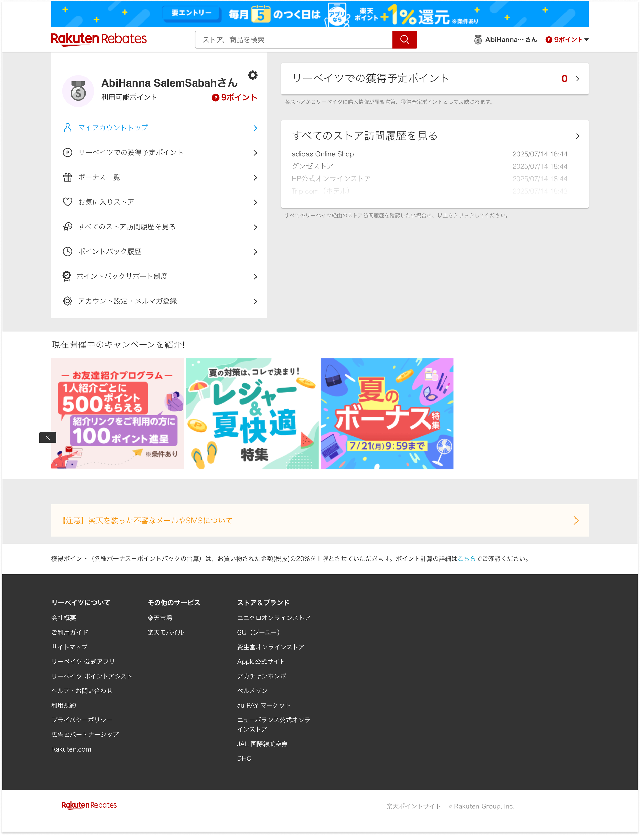
Given the extra real-estate on PC, I decided to turn it into a menu, which is a pattern we later reused on other heavy content pages such as the help page.
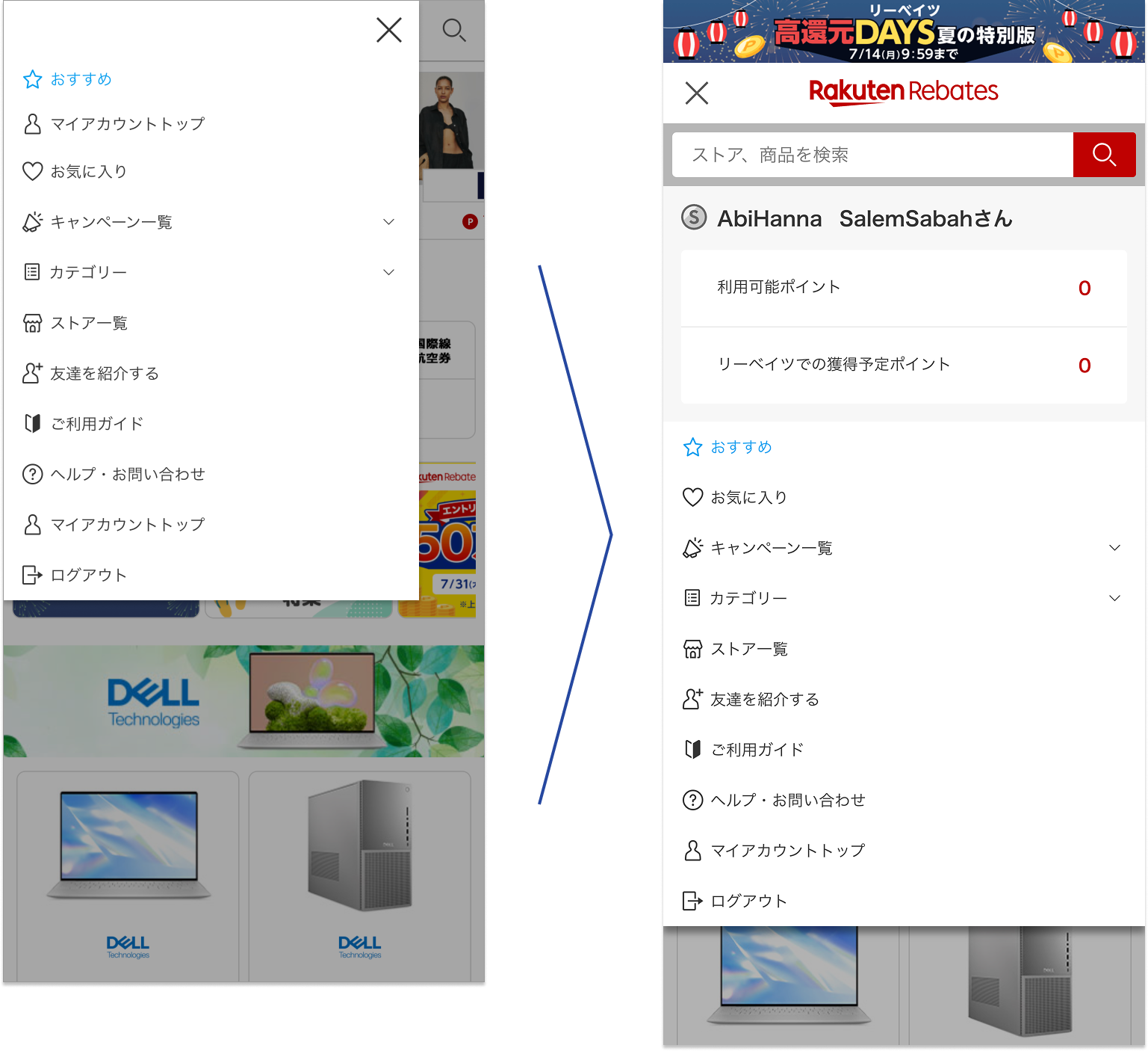
As for the phone layout, the menu was merged into the main navigational drawer to create a more seamless experience for navigating to My Accout.


